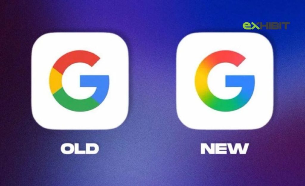
Google has updated its iconic ‘G’ logo, introducing a new gradient effect design which is marking the first major visual redesign in nearly a decade.
After nearly 10 years, Google is rebranding its famous ‘G’ logo. The tech giant has unveiled a refreshed version of its colorful emblem, replacing the solid red, yellow, green, and blue colors with a smooth, dynamic gradient transition. This subtle but significant update reflects Google’s continued evolution and its deepening focus on artificial intelligence (AI).
The New Look: What’s Different About Google’s Updated ‘G’ Logo?
Instead of the traditional flat and blocky colors, the updated Google ‘G’ logo now features a vibrant gradient that blends all four primary colors. This gives the logo a more modern, fluid, and digital-friendly appearance.
The redesign is especially effective for smaller screen sizes, offering a softer and more visually appealing feel. The updated design is also optimized for today’s screen technology, making it easier to identify and read across various platforms and devices.
Aligned with Google’s AI Vision
This redesign is more than just a cosmetic update which signals Google’s strategic shift toward artificial intelligence. The new logo complements the branding of Google Gemini, the company’s generative AI assistant, which features its own blue-to-purple gradient motif.
By aligning the new ‘G’ with its AI-first strategy, Google is creating a cohesive visual identity that emphasizes innovation, intelligence, and cutting-edge technology.
Also Read: YouTube Tests Shared Premium Plan for Two Users at Rs 219 per Month: Report
Rollout Begins with iOS and Pixel Devices
The new Google ‘G’ logo is currently rolling out to iOS users via the Google Search app. It has also begun appearing on select Android devices, primarily through the Google app beta version 16.18.
At this stage, the updated icon is mostly visible on Pixel smartphones and some iOS devices. The old ‘G’ logo remains in use on most other platforms, including web browsers and non-Pixel Android devices. Google has not announced a specific date for the full rollout, but the redesigned logo is expected to become more widely available in the coming weeks.
Will Other Google Logos Be Updated Too?
As of now, the main Google wordmark remains unchanged. There’s no official word yet on whether logos for other key products such as Google Chrome, Gmail, Google Maps, or Google Drive will follow suit. However, considering the company’s recent branding shift toward gradient and AI-themed visuals, it seems likely that more updates are on the horizon.
A Strategic Visual Shift for Google
The Google ‘G’ logo is one of the most recognizable tech symbols in the world, featured across billions of devices, browser tabs, and app icons. While the redesign might seem subtle, it represents a significant shift in how Google is aligning its brand identity with its future vision.
This marks the first major update to the ‘G’ logo since 2015. With its new gradient design, Google is embracing a modern, AI-driven direction while retaining the familiar colors users know and trust. As tools like Gemini AI become more central to Google’s ecosystem, the redesigned ‘G’ could be just the beginning of a broader visual rebranding initiative.


1 Comment
Pingback: Tech Weekly Wrap: Google, Prime, Android & More Updates